Introduction
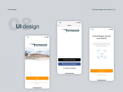
StratosJets is one of America’s leading private charter companies. The main reason why they approached us is that they only had a web application, and most users expect a mobile phone application. They noticed that the main problem is that users do not want to go to the company’s website, but prefer to do it through the mobile application, as they are used to doing with some other similar companies.
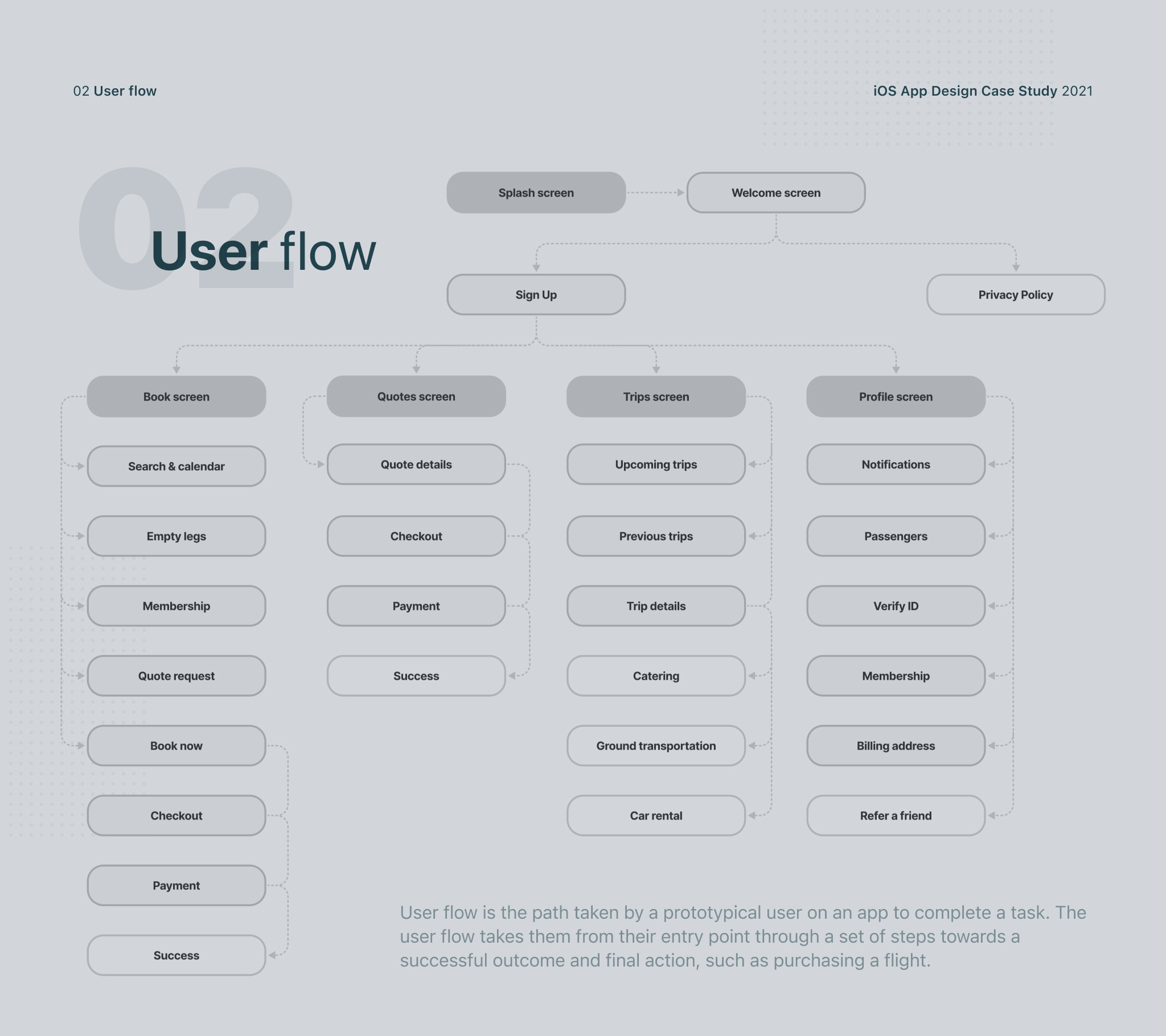
We started the cooperation with a series of meetings where the client explained to us how the web application works. We further discussed how we can transfer it to the iOS application, what are the problems and how can we overcome them. Once we had a complete picture of what the web app looked like, the designer created a user flow so that we could make a clear plan at the beginning of which and how many screens the iOS app should contain.
Wireframes
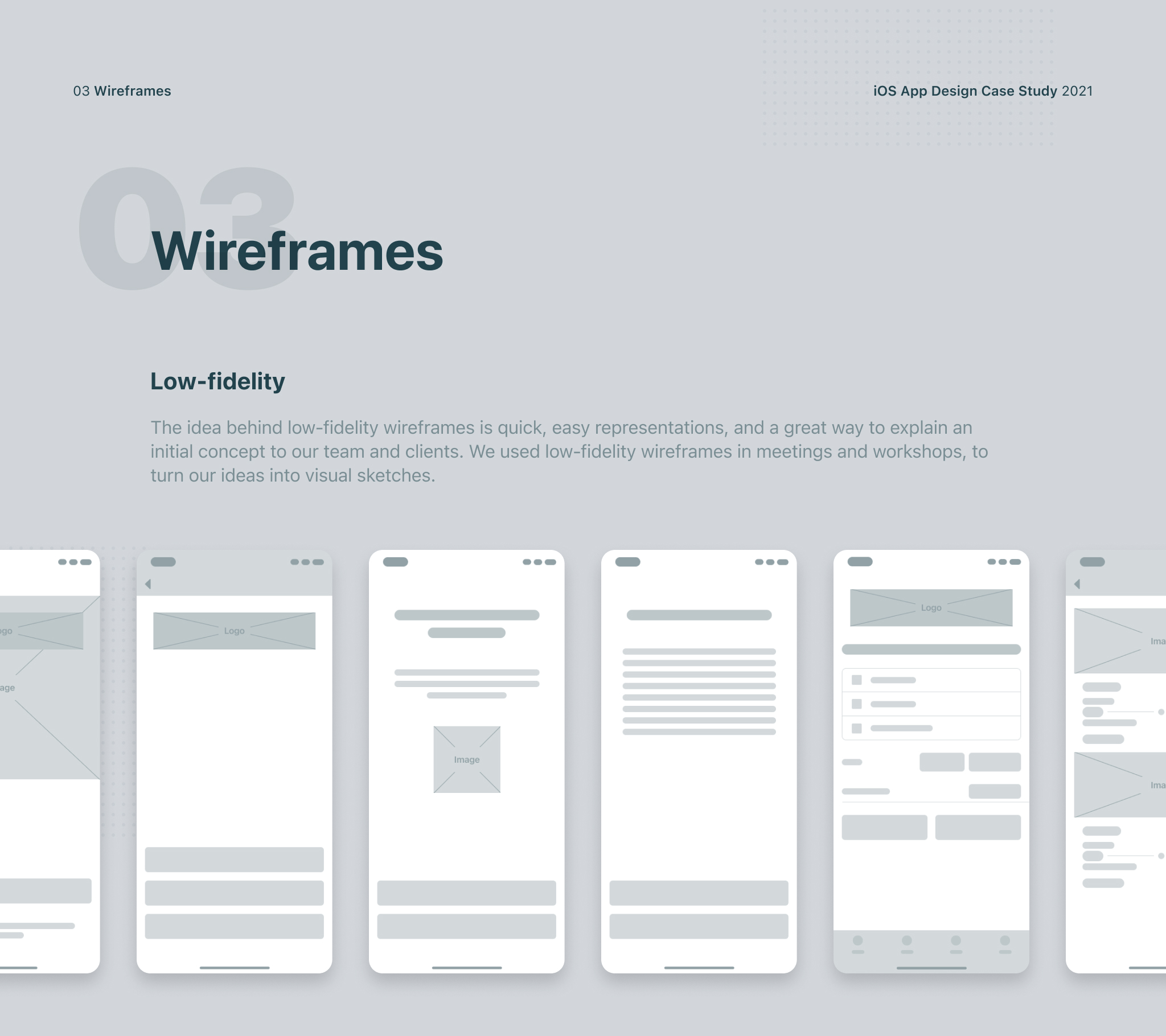
Since we only had a web application design, we started methodically creating wireframes. Once we had the first version of the wireframes, we started a series of iterations with the client to determine what would work for their users and what needed to be changed or added. Once we agreed with the client on the final version of the low-fidelity wireframes, then we moved on to the next phase of product development.
Main experience
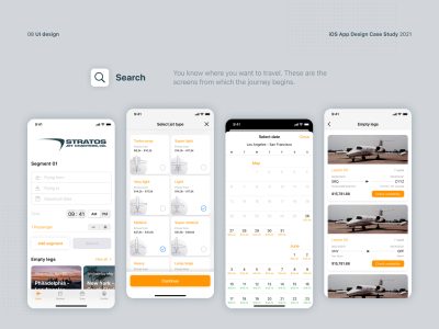
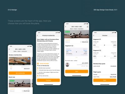
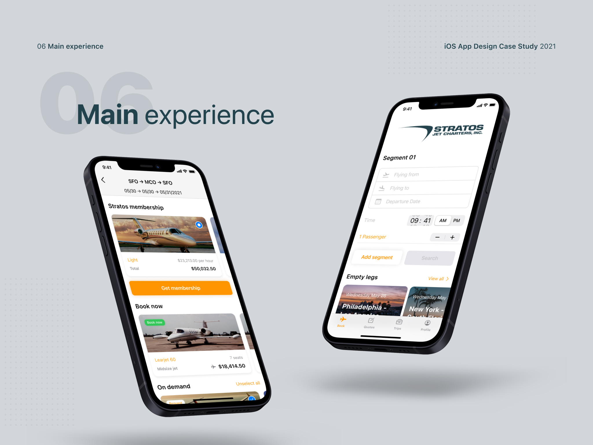
There are four main experiences. The first involve a flight search screen and was particularly challenging because the search form had to be adapted for iOS, which is very different from the web. The second experience is a screen that consisted of three different sections – Stratos membership, book now, and flights on demand. This screen differed in many ways compared to the web application and it was necessary to devise a flow that would be an ideal compromise between the client’s requirements, the capabilities of iOS, and the experience of future users.
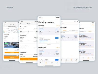
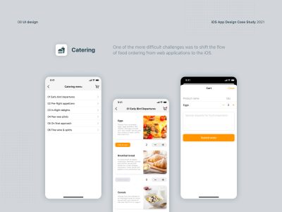
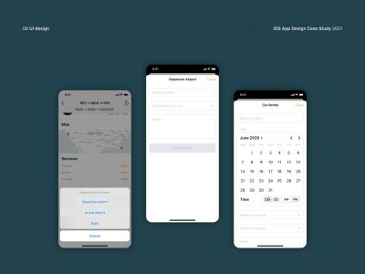
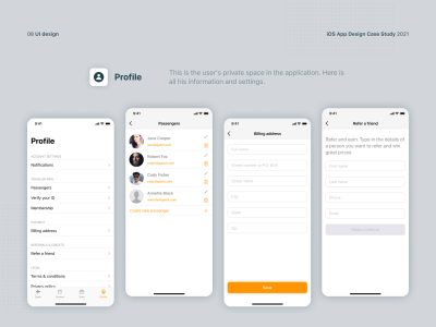
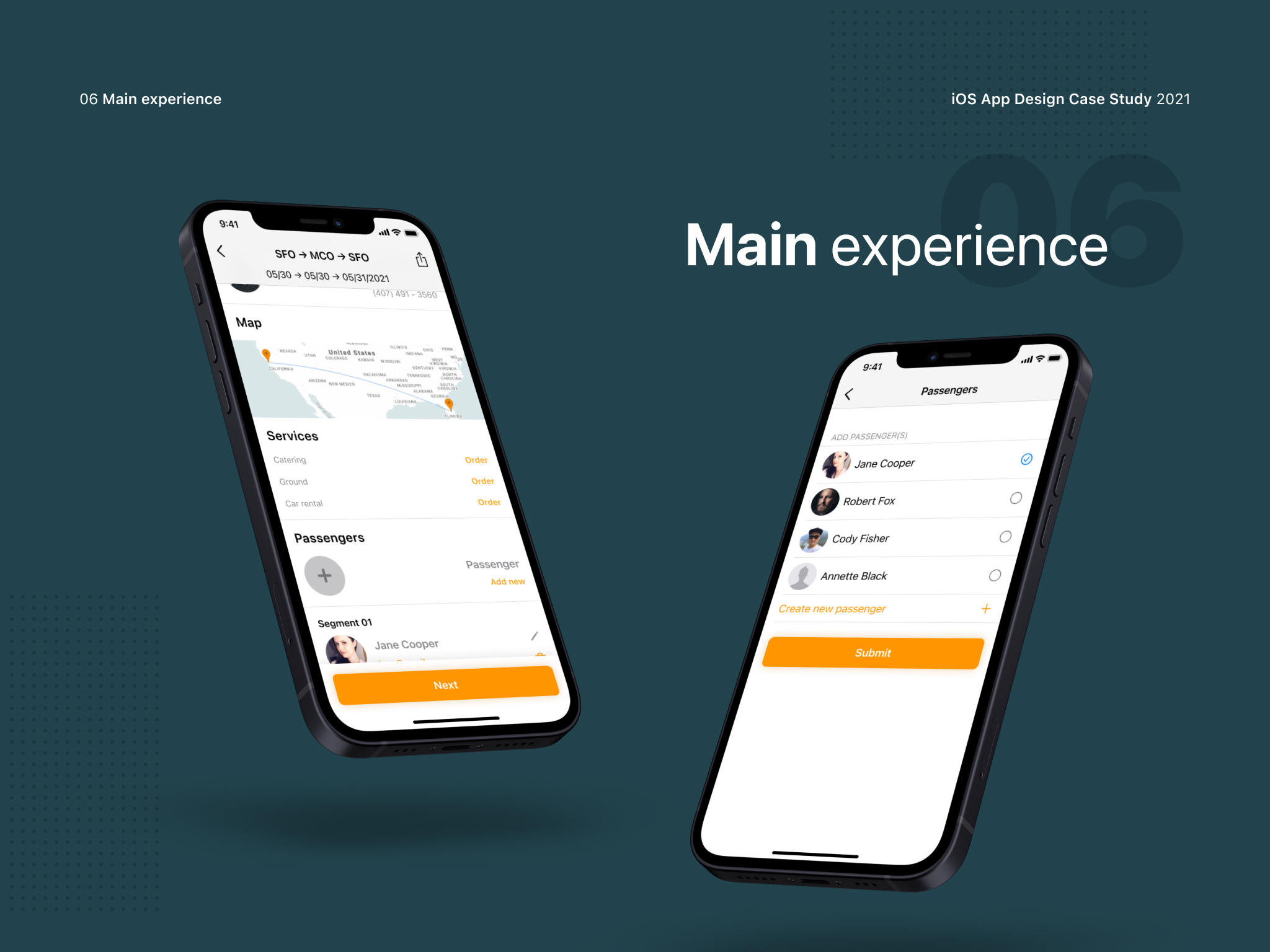
The third experience is passenger management. On any flight that can be booked and paid for immediately, there was an option for adding passengers. Passengers can be created within each user’s profile or directly on this screen when a flight needs to be booked. This was a functionality that already existed in the web app and we just needed to find a way to implement it in the new iOS system. When the flight is booked and confirmed, the user is given the choice to add some more services. There is the option of ordering food to be served during the flight or renting a car that would be available after landing at their chosen destination. This is the fourth experience.
Jet type
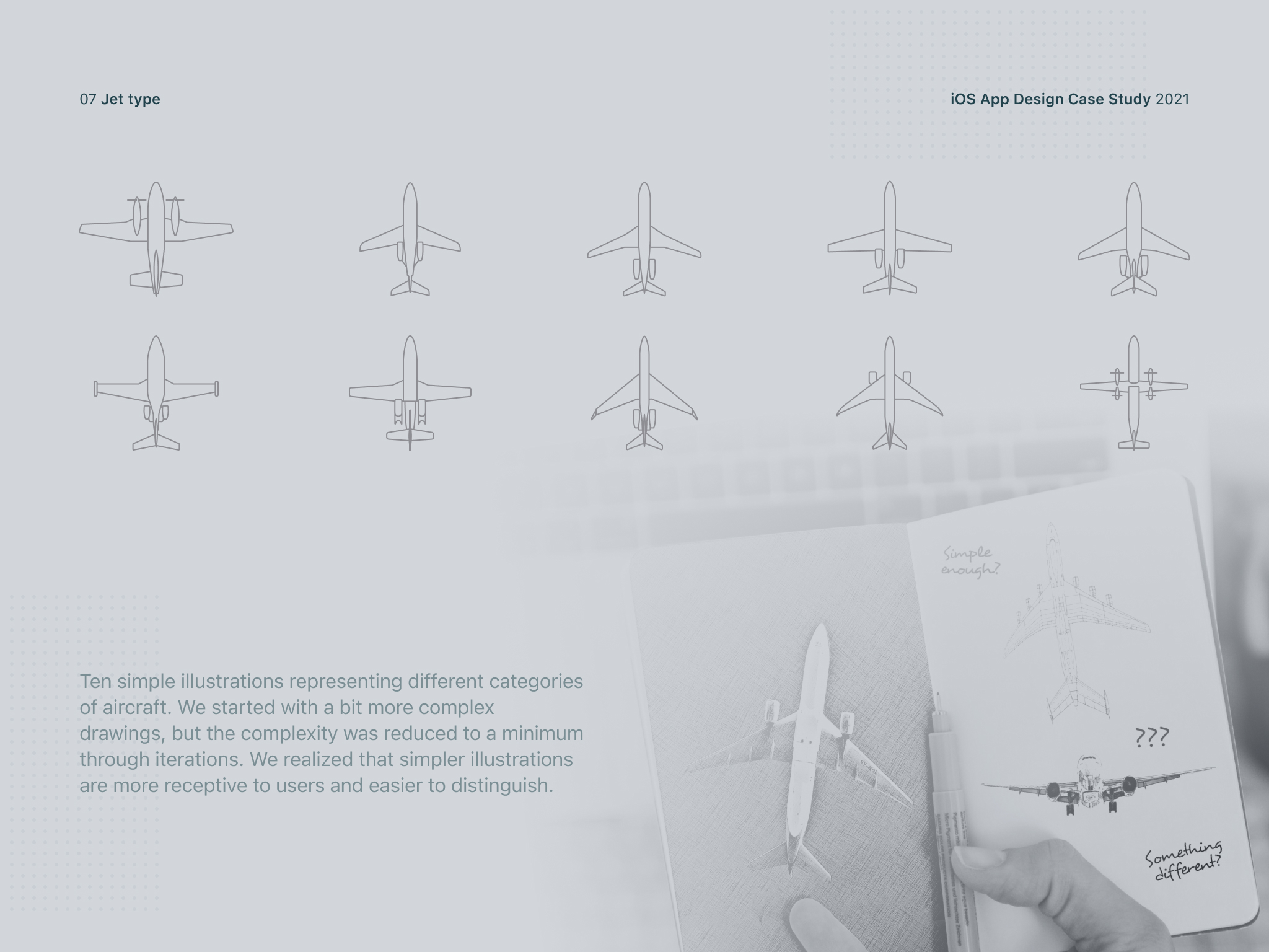
The client had an idea to display aircraft categories in one of the steps when searching for flights but had no idea how to do it. Our designer helped him with ten uniquely designed aircraft illustrations for each category. The idea behind the illustrations was a visual representation of each category so that future users would be able to quickly understand what kind of aircraft they are choosing. We started at the beginning with slightly more complex illustrations, but during iterations with the client, the final solution became much simpler. We realized that simpler illustrations are more receptive to users and easier to distinguish.
Conclusion
As the client had full confidence in our decisions and respected our suggestions and professional solutions, we were able to double the user conversion with the final iOS app. The intuitive design allowed prospective customers to navigate the app more easily and search for available flights faster. We exceeded our client’s expectations and created a product that became not only a leader in its industry but also a role model for other similar applications.


