Introduction
Privatni Smjestaj is an online platform that connects travelers with private accommodation hosts in Croatia. With Privatni Smjestaj, travelers can find and book the perfect accommodation for their holiday, from traditional apartments and villas to unique homestays and private rooms. All properties are verified by local hosts to ensure the best possible experience for every guest.
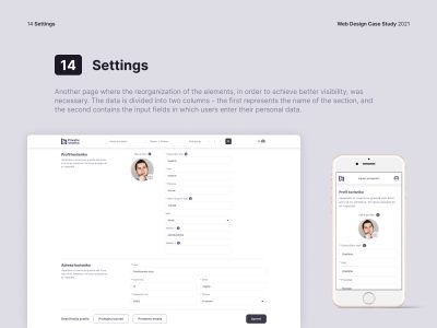
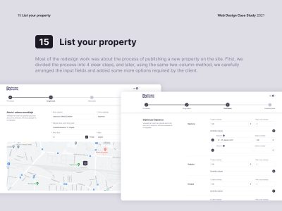
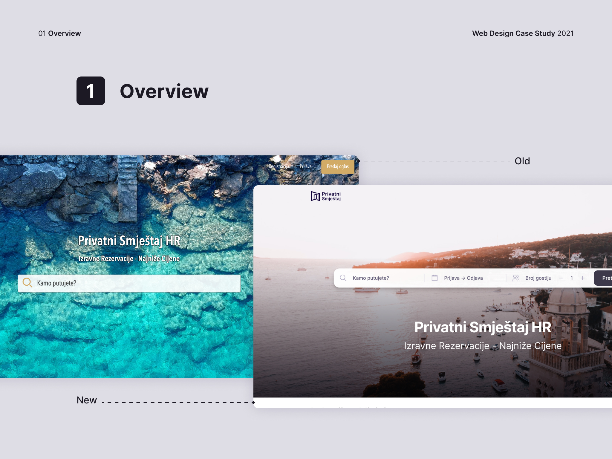
The client approached us because the previous version of the design of the online platform was done by the developer and it did not turn out the best in terms of user experience. Since the online platform has reached the level where it already has a large number of users, the client decided to hire design professionals to redesign the platform with the aim of offering its users the best possible experience. That’s where we come in.
Design stages
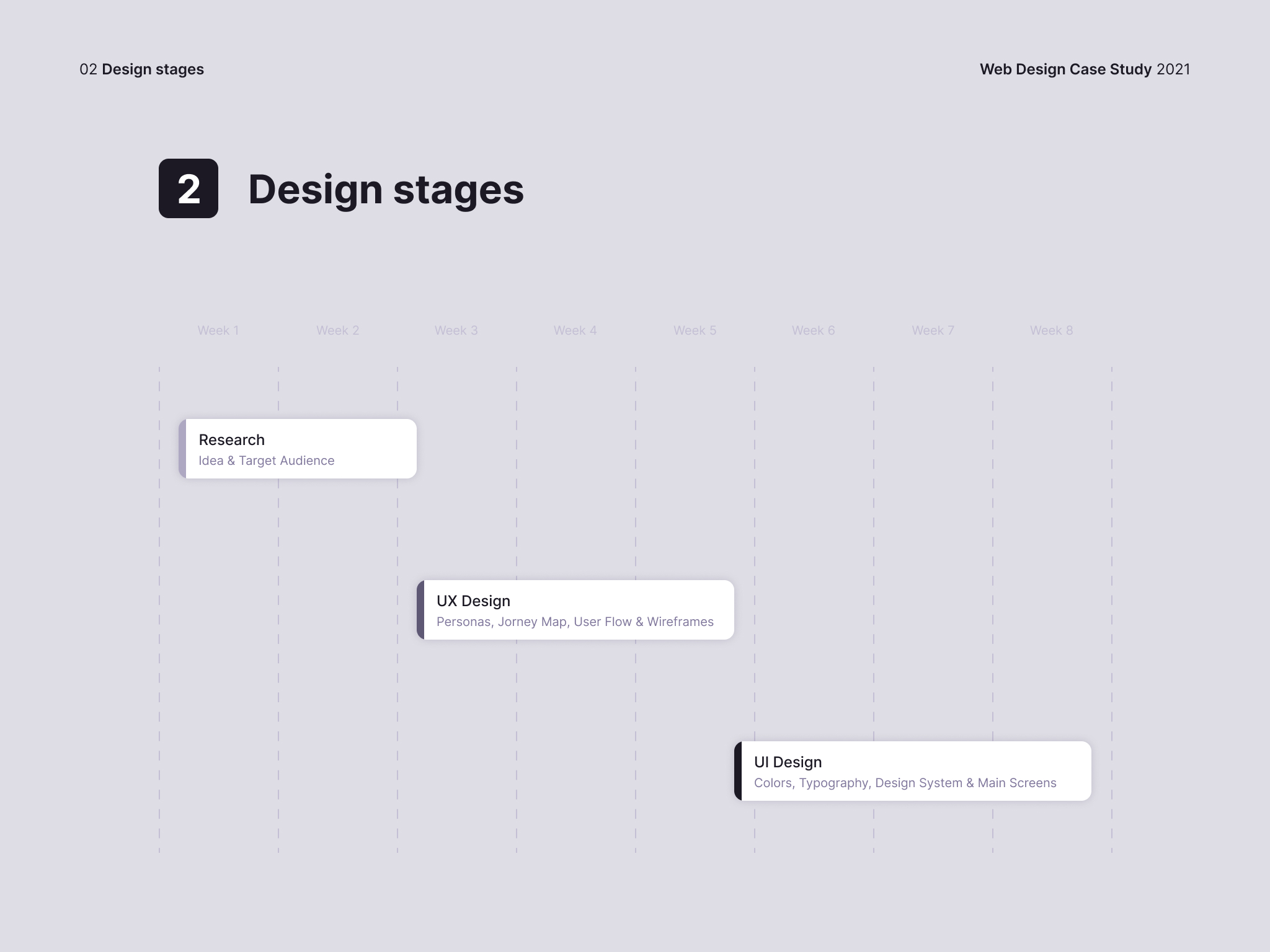
Here are the most important steps designer have taken in the design process, from the idea to the final product. Important decisions are divided into three stages, each of which includes several necessary substages. During a series of meetings with the client, and after agreeing on which direction we should go, we decided that the whole redesign process takes, more or less, 8 weeks.
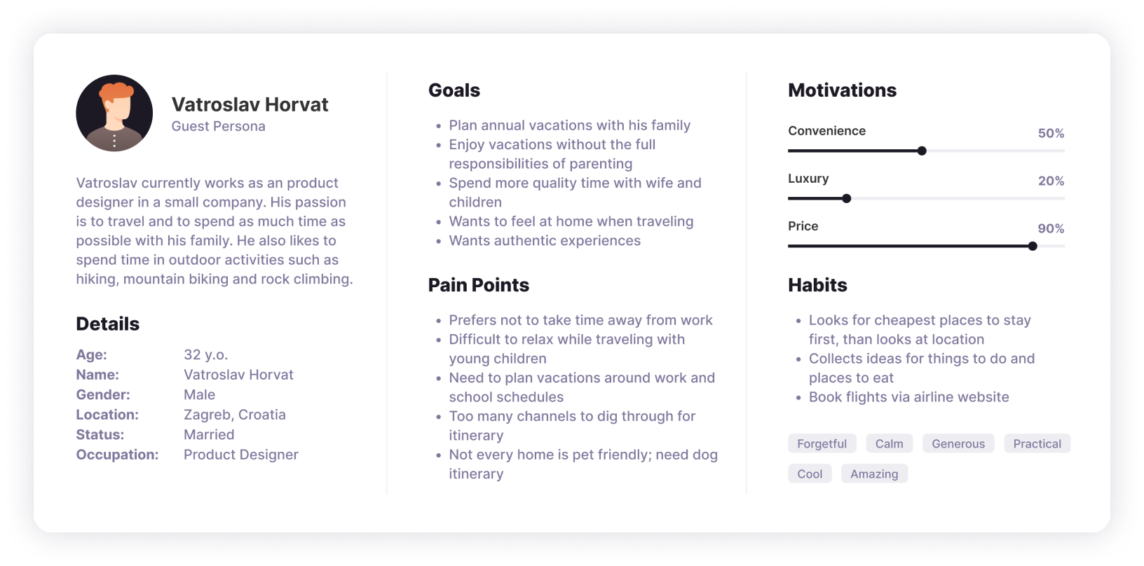
Personas
The first thing we did was to define some of the typical users of the platform from both categories – guests and renters. Given that the platform has been operating for some time, the client already had ready data on the basis of which we were able to quickly form user personas that will later serve us to better understand the goals and pain points of the future platform’s users.
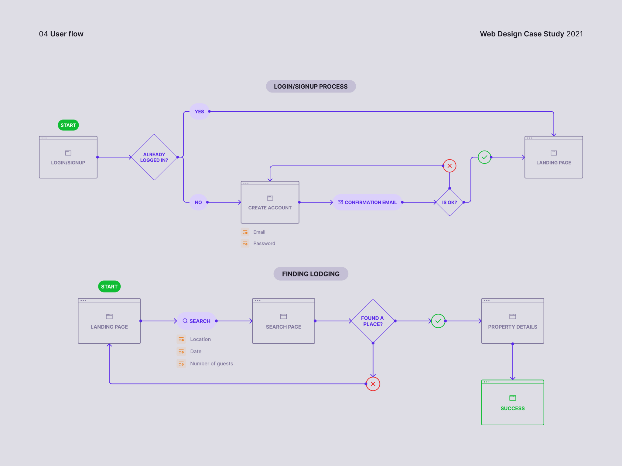
User flow
After creating the user persona, we had to map the user flow to understand how the platform actually works, if the flows are simple and intuitive enough, and if we can change anything to improve the existing flows.
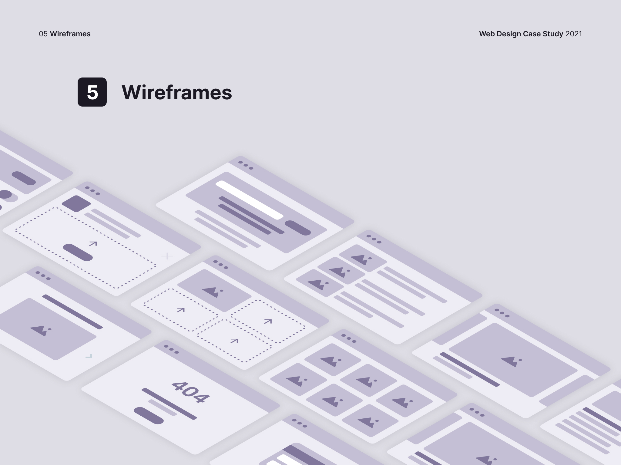
Wireframes
Since we understood the user flow and how the users move through the application, we started designing low-fidelity wireframes that are two-dimensional illustrations of a page’s interface that specifically focuses on space allocation and prioritization of content, functionalities available, and intended behaviors. For these reasons, low-fidelity wireframes typically do not include any styling, color, or graphics. Wireframes also help establish relationships between a website’s various templates.
Design system
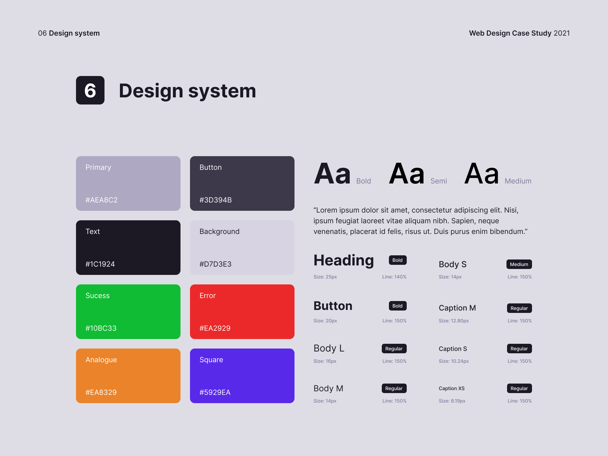
Once we agreed on the position of the elements on the pages, the next phase was building the design system – a very important part of any good design. According to the client’s requirements, I chose the basic colors to be neutral. All other colors are based on basic colors and can be freely combined with each other. Font selection is based on readability and simplicity.
Logo redesign
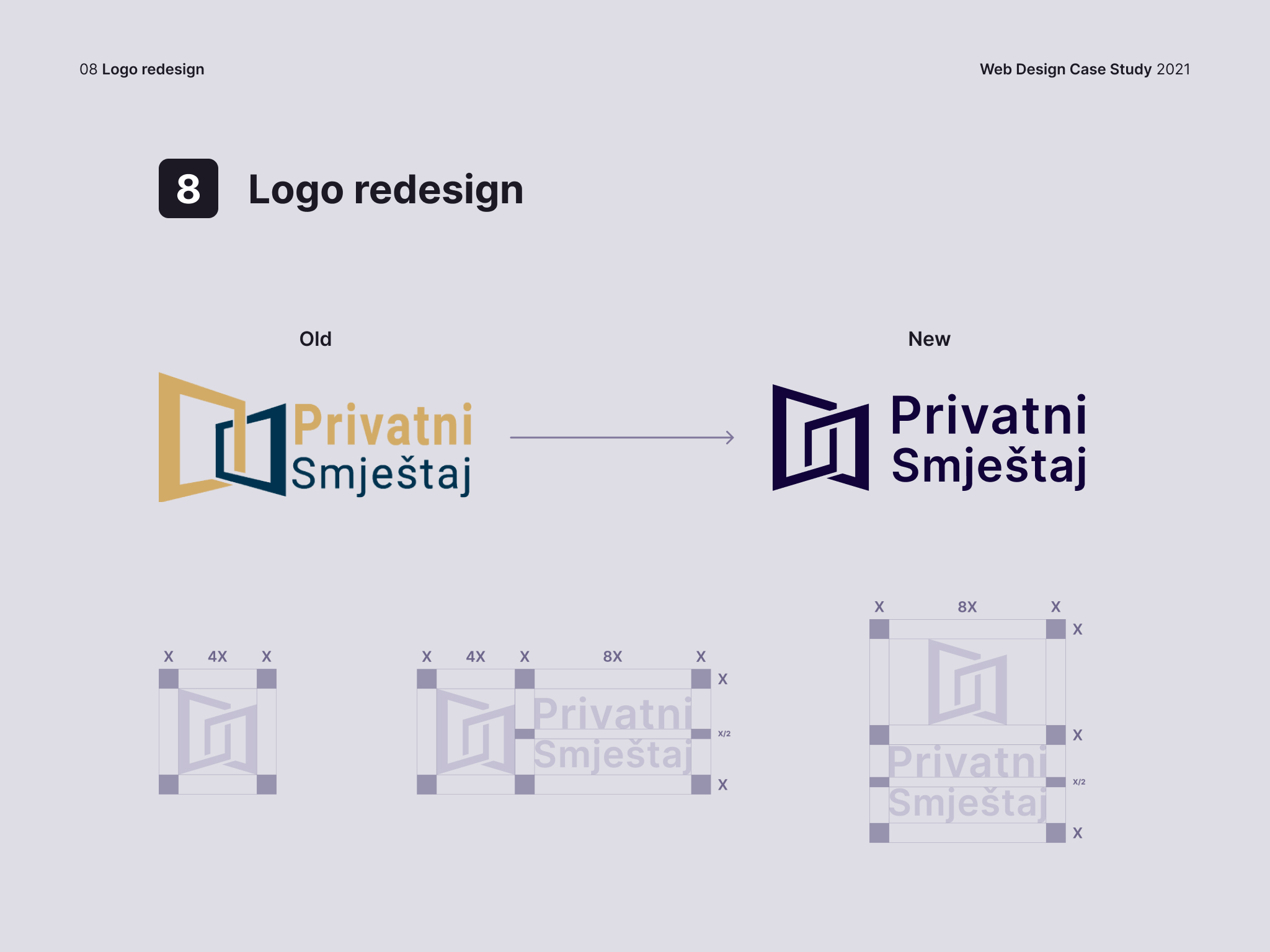
The site’s redesign required an appropriate logo that fits the new aesthetic. The client was involved in the existing concept and wanted to expand and improve the idea itself. That’s why we replaced the font and just fine-tuned and balanced the symbol to make it look more elegant and harmonious.
Conclusion
Overall, the website redesign is a welcome improvement. It has made the website more accessible, visually appealing, easier to use, and more secure. This has helped to ensure that users have a positive experience when using the website and to make it easier for them to find and book accommodation. The client was extremely satisfied, and the new design of the platform enabled him to achieve great business success.


